In early 2015, the website wasn't a priority; at the time, the responsibility of editing content on existing pages fell to whoever wanted to make changes. But with business growth came the desire to add new pages and features—a replatform was necessary.
For this project, I had hands-on experience conducting card-sorting exercises and creating wireframes and user flow charts. We weren't concerned about major visual design changes; instead, we wanted to focus efforts on boosting website conversion rate. In Google Analytics, we learned the following:
1. High exit rate on the homepage. Most users left the website after viewing the homepage without exploring any other pages.
2. The About page had the most amount of page visits. Additionally, users on the homepage tended to click the About button first.
3. Product or service-specific pages also had a high exit rate. Users would simply exit the website, instead of exploring other pages or reaching out to the team.
It's important to note that many of these website visitors weren't existing clients (or even the marketers who would ultimately use the platform)—they were CMOs and corporate executives who wanted to bolster the company's digital presence and brand reputation. Ultimately, the objective of the website was to convert potential customers into paying clients.
Restructuring the information
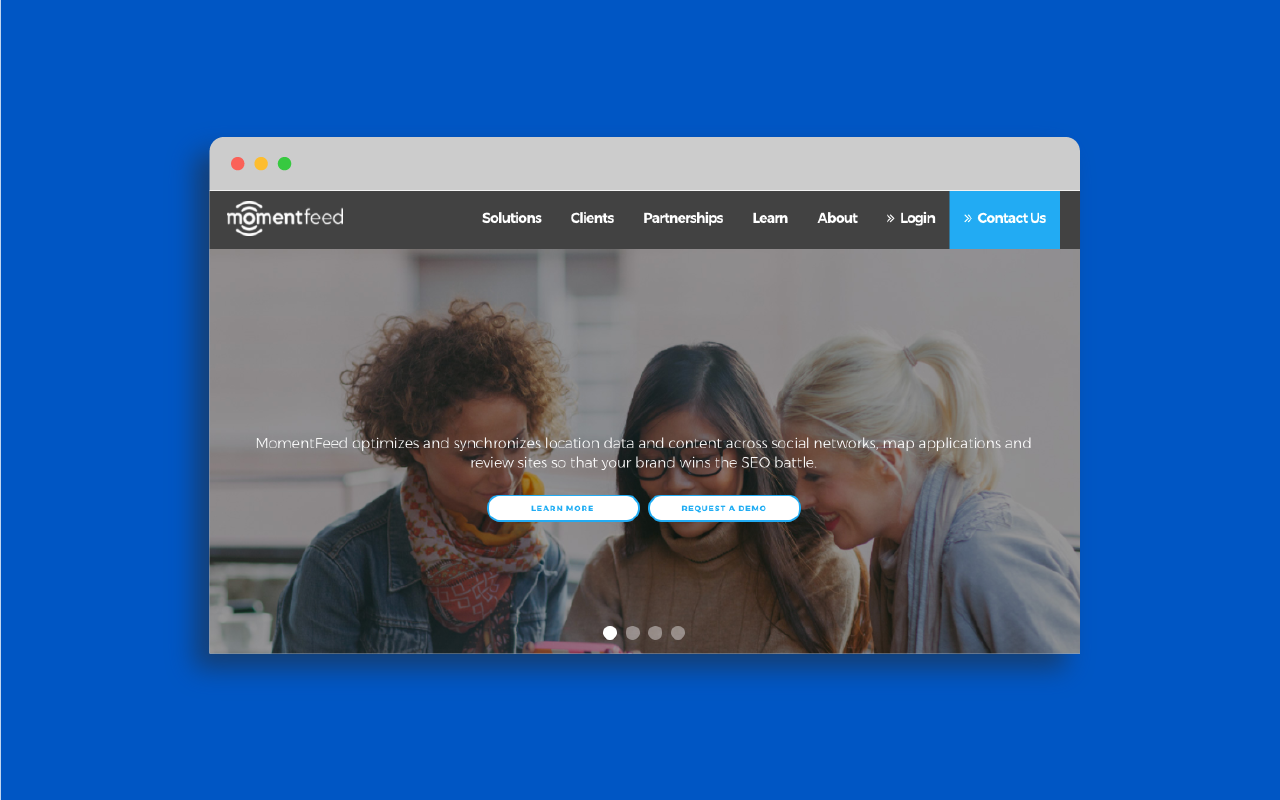
Our first objective was to make content easier to find.
In the past, we used buzzwords like 'localized marketing solutions' and gave our products names like PinSync and LocalVoice. These ambiguous terms only confused users and pushed them to the only familiar title—the About page.
We hypothesized that changing our navigation would yield higher page visits to our product or service-specific pages. We wanted users to be able to find what they need on the website, as well as understand where each link on the menu will take them.
Through card sorting, we were able to build a new structure for our website, as well as identify better labels for our navigation links. We found that our straight-forward titles were more intuitive for and resonated with users. When we stopped hiding our content behind confusing page titles, we saw an increase in website traffic and activity.
Looking at a six-month period from January–July 2015 compared to the same six-month period from January–July 2016, we saw a 24.23% increase in page views across the entire website. While our bounce rate overall was still steadily improving, users began to visit other pages upon landing on the homepage.
Improving the call-to-action buttons
Our next objective was to encourage our visitors to take action.
The homepage primarily served as a landing page for visitors from webinars, networking conferences, and email marketing campaigns. The idea was that executives, most of whom were already familiar with MomentFeed, would then reach out to the team. These were visitors with a very high potential for conversion—and yet, we still had high bounce rates.
This wasn't necessarily an issue of confusing navigation links, though. On the website, visitors weren't prompted or encouraged to establish contact or take action. Any contact or request buttons were largely unnoticed, existing at the bottom of pages.
CTA buttons need to be visible and have strong visual cues. We opted for Request a Demo buttons in key locations on the page—we wanted to ensure that visitors would see them both immediately upon entering the page and after exploring the content. Additionally, we added a Contact Us button to the fixed navigation menu that was visually-distinctive from other navigation links.
When examining the website in August 2016, we saw a 46.78% increase in form submissions YTD compared to the same period in the previous year.